
Your typeface has a traffic meter
Font licensing has quietly turned from a one-off purchase into a bill that grows with your success. Choose type the way you would sign a lease, at the identity stage, before the meter starts.
- Section
- Brand
- By
- Simon Lodge
- Published
- 11 November 2026
- Reading
- 5 min read
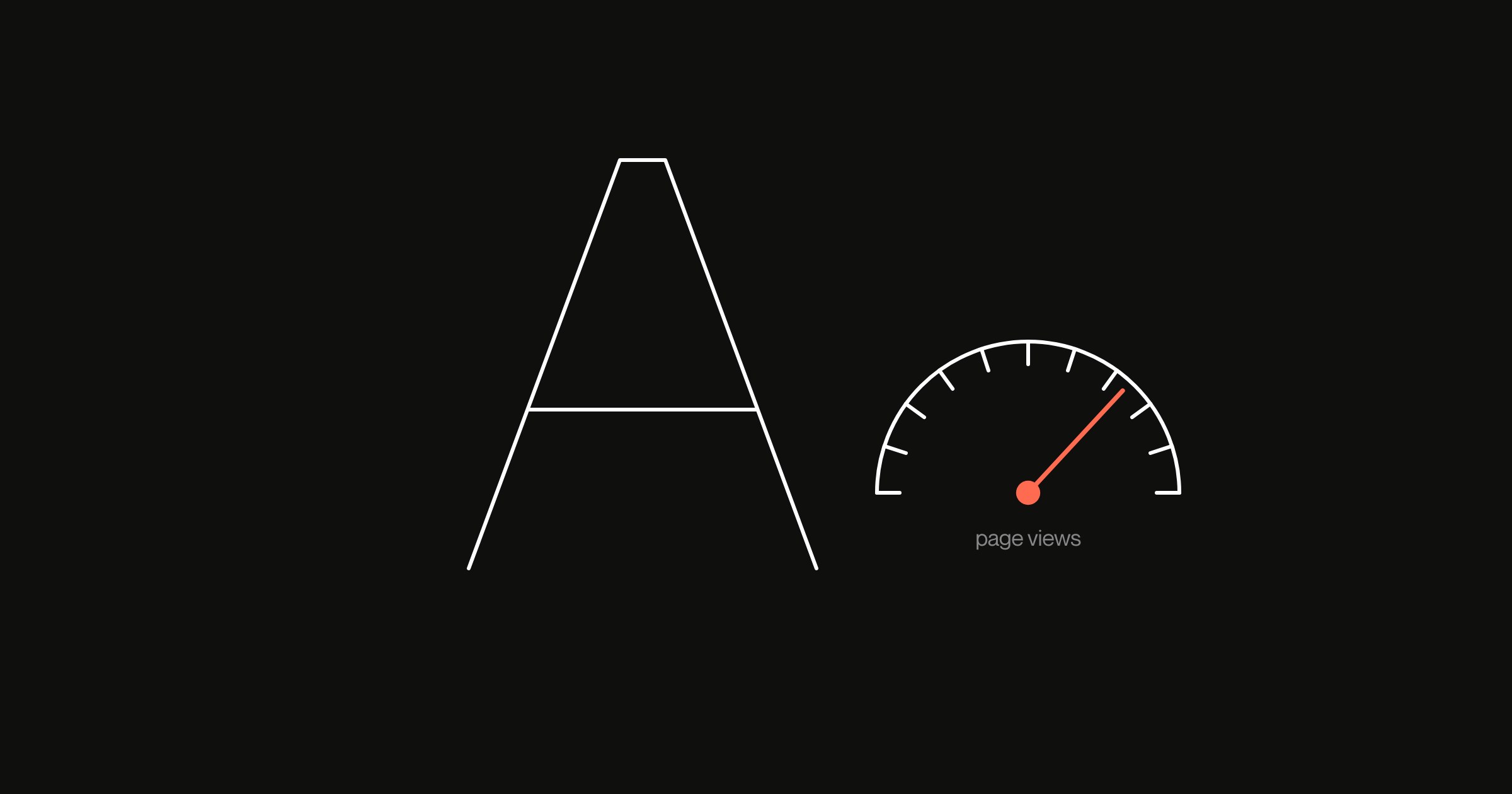
The typeface in your brand guidelines has a meter on it. Most companies only find out about font licensing when that meter ticks over.
Look at how the world’s largest type company prices its enterprise plans. Monotype’s published tiers start at $2,500 a year for five users, three fonts and 1.5 million monthly page views. Its Standard plan costs $20,500 a year. That buys five users, five fonts, 20 million monthly page views, 100 million ad impressions and five apps.
Its own guide also says customers can “buy additional fonts, seats, web page views, ad impressions, and applications as needed” (Monotype).
Now read that list again as a growth company. Every line on it is a measure of success: more traffic, more people, more campaigns, more products. So the better the business does, the more the letters cost.
The landlord owns most of the street
This would matter less if type were a market of small, competing foundries. Increasingly, though, it isn’t.
Monotype bought Linotype in 2006, which brought Helvetica, Frutiger and over 6,000 other typefaces (MyFonts). Then in 2019 the private equity firm HGGC agreed to take Monotype private, in a deal worth about $825 million. In 2021 it also bought Hoefler&Co, the foundry behind Gotham, along with Fontsmith (It’s Nice That).
Gotham shows how little choice a brand can end up with. Netflix used it for years. Then in 2018 it switched to Netflix Sans, a custom face by Dalton Maag. At the time, the press reported the move as a response to rising licensing costs. Three years later, Gotham’s foundry belonged to Monotype.
When one owner holds that much of the street, it can rewrite the lease. Japanese game studios found this out at the end of 2025. Fontworks, a Monotype company, withdrew a game plan priced at $380 a year. The only alternative on offer cost $20,500 a year.
Monotype said it was aligning older programmes “with current global standards”. After a backlash, it brought the old plan back for a few months. It then replaced it with a revised plan whose integration fee had tripled, plus a distribution cap nobody could quite define.
We wrote about rented land in the context of audiences. Type is the same deal in miniature. You build years of recognition on letterforms you rent, while the rent follows the landlord’s plans.
The font licensing you thought you had
The other common trap is assuming your design software already covers the font. Adobe Fonts is generous for lots of work, such as print, video and logos. Still, its licensing FAQ is clear about what it leaves out (Adobe).
For example, it doesn’t cover embedding fonts in mobile or desktop apps, or installing them on servers. Nor does it cover products where customers set their own text in your fonts. And if the subscription lapses, editable files open with missing fonts.
Think of a company that started with a slide deck and now ships an app, a configurator and a partner portal. Sooner or later, every one of those gaps applies.
There is also a new clause to read. A growing number of independent foundries now restrict AI use. July Type’s current licence, for instance, forbids its fonts being “utilized in any AI-related applications or processes” (July Type EULA). Lineto and Cape Arcona forbid using their fonts to train AI systems. So if your team makes campaign assets with AI tools, your typeface licence may have an opinion about it.
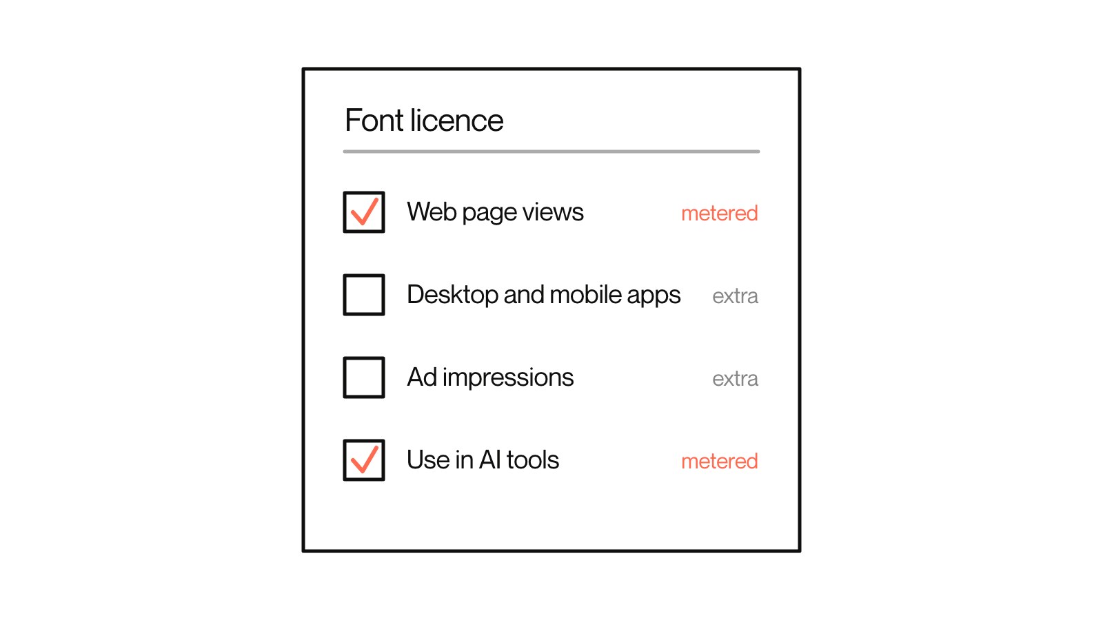
A metered licence is a tax on growth that you agreed to before you had any.
Free type is free for everyone
The obvious escape is open source fonts, and it is a fair one. The HTTP Archive’s 2025 Web Almanac found that around 64% of websites use at least one font under the SIL Open Font License. That licence allows use on websites, in logos and inside apps. Meanwhile, Google Fonts sits on roughly half of all sites.
The catch is in the name. Inter is an excellent typeface, for example, and it is also the default font in Figma, where many brands now begin. Start from the default, never leave it, and a whole category ends up looking like one company.
That is the argument we made in competence is now free. The competent choice is the common one, and common is the opposite of distinctive.
The third route: a custom typeface
IBM showed another way out. In 2017 it replaced Neue Helvetica with IBM Plex, a typeface of its own. That reportedly saved it around $1 million a year in fees. IBM then released Plex under an open licence. As a result, it owns a face that is unmistakably IBM, pays nobody for it and lets anyone use it.
Of course, most growth companies are not IBM, and they don’t need to be. A custom typeface is no longer a Fortune 500 indulgence. Jamie Clarke Type, for one, publishes its rates: £10,000 to £16,000 for a single style covering Western European languages (Jamie Clarke Type). Adapting an existing design starts at around £5,000.
Set that against a metered licence that rises every year you grow, and the sums can turn quickly. Modern formats help, too. A single variable font file can hold a whole family, and in one test it cut file size by 88%.
Choose type like a lease
None of this means every company should commission a typeface tomorrow. Rather, it means you should choose type at the identity stage as a commercial decision as well as an aesthetic one.
First, read the font licensing terms before you fall in love with the face. Ask what it meters, what it excludes and what happens if the owner changes. Then map where the brand will live over the next three years. Include the app you haven’t built yet and the AI tools your team will use. Price the licence against that, not against today’s website.
After that, pick between three routes on purpose. You can license a commercial face and budget for the meter. You can use an open face and do the work to make it yours, through weights, details and pairing. Or you can commission one, own it outright and stop paying rent on your own voice.
After all, the letters are the part of your brand people see most often. They should be the last thing you discover you don’t own.